
There’s a moment that happens in every campaign review meeting.
The spreadsheet is open. The metrics are trending down. And someone—usually the person who didn’t build the campaign—leans back in their chair and says: “We need to optimize everything.”
And that’s exactly when the money starts leaking.
Because here’s what most marketers don’t realize: your campaign doesn’t need everything fixed. It needs the right three things fixed. And there’s a 139-year-old economic principle—and a simple chart—that can show you exactly which three.
The Pea Pods That Changed Economics
In 1896, an Italian engineer named Vilfredo Pareto was studying wealth distribution patterns when he noticed something peculiar in his garden. About 80% of his pea harvest came from roughly 20% of his pea pods.
He looked at land ownership in Italy. Same pattern. 80% of the land was owned by 20% of the population.
What Pareto discovered wasn’t just an agricultural curiosity. It was a fundamental law of distribution that shows up everywhere: in economics, in business, in quality control, and yes—in your Google Ads campaigns right now.
The Pareto Principle, also called the 80/20 rule, states that roughly 80% of effects come from 20% of causes. And the Pareto chart is the visual tool that makes this imbalance impossible to ignore.
What Actually Is a Pareto Chart?
A Pareto chart combines a bar chart and a line graph. The bars represent individual values in descending order (largest to smallest). The line represents the cumulative percentage.
Here’s what makes it powerful: the visual immediately reveals which factors account for the majority of your result. You don’t need to squint at spreadsheets. You don’t need to run pivot tables. The chart screams at you: “These three things are eating your budget.”
In digital marketing, this means:
20% of your keywords drive 80% of your conversions.
20% of your ad creatives generate 80% of your clicks.
20% of your audience segments produce 80% of your revenue.
And the inverse is also true: 80% of your wasted spend is concentrated in 20% of your worst-performing elements.
Why This Matters More in 2026 Than Ever Before
We live in an era of algorithmic abundance. Performance Max. Broad match. AI-generated creative. The platforms tell us to “trust the algorithm” and “let the machine learn.”
And they’re not wrong.
But algorithms don’t care about waste. They care about learning. They’ll happily spend $5,000 testing 47 different audience signals if you let them. Meanwhile, you’re watching your CAC climb and your CFO is sending Slack messages with question marks.
The Pareto chart cuts through this. It doesn’t argue with the algorithm. It shows you, with brutal clarity, where the algorithm is spending your money and which parts of that spending actually matter.
Think of it as X-ray vision for campaign performance. The algorithm is the engine. The Pareto chart is the diagnostic tool that tells you which cylinders are misfiring.
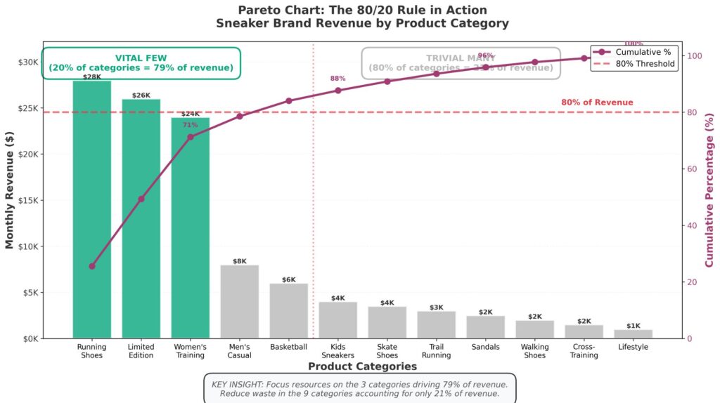
Real Example: The Sneaker Brand That Cut Spend by 40% and Increased ROAS by 63%
Let me show you this in action.
In late 2025, a direct-to-consumer sneaker brand was running Google Shopping campaigns across 12 product categories. Total monthly spend: $87,000. ROAS: 3.2. Not terrible, but not great.
The team built a Pareto chart showing spend by product category. Here’s what they found:
Three categories (“Running Shoes,” “Limited Edition Collabs,” and “Women’s Training”) accounted for 79% of revenue.
Nine categories accounted for 21% of revenue but consumed 52% of the budget.
The cumulative percentage line on their Pareto chart crossed the 80% threshold at category three. Everything to the right of that line was statistical noise dressed up as “diversification.”
They didn’t kill the other nine categories. But they did something smarter: they pulled budget from the underperformers and reallocated it to the vital few. They tightened audience targeting on low-performers and expanded it on winners. They let Performance Max do its thing—but only where it was actually working.
Two months later:
Total spend: $52,000 (down 40%)
ROAS: 5.2 (up 63%)
Same algorithm. Same platform. Different decision-making framework.
How to Build a Pareto Chart for Your Campaign (Step by Step)
You don’t need specialized software. Google Sheets or Excel will work fine. Here’s the process:
Step 1: Export Your Data
Pull the metric you care about. Common examples:
Spend by keyword (to find budget-draining search terms)
Conversions by audience segment (to find your best customers)
Impressions by ad creative (to see what’s getting ignored)
Clicks by device type (to find mobile vs. desktop imbalances)
Choose one dimension and one metric. Keep it simple.
Step 2: Sort Descending
Arrange your data from largest to smallest. This is critical. The Pareto chart only works if the bars descend from left to right.
Step 3: Calculate Cumulative Percentage
Add a column that shows the running total as a percentage of the whole. For example:
Keyword A: $12,000 spend (30% of total)
Keyword B: $8,000 spend (50% cumulative)
Keyword C: $6,000 spend (65% cumulative)
And so on. The last row should hit 100%.
Step 4: Create the Chart
In Excel or Google Sheets:
Select your data
Insert a combo chart
Set the bars to represent your metric (spend, conversions, etc.)
Set the line to represent the cumulative percentage
Add a horizontal line at 80% on the cumulative axis
Boom. You’ve got your Pareto chart.
Step 5: Ask the Brutal Question
Look at where the cumulative line crosses 80%. Everything to the left of that point is the vital few. Everything to the right is the trivial many.
Now ask: what happens if I cut the budget from the trivial many and give it to the vital few?
Three More Ways Digital Marketers Are Using Pareto Charts Right Now
1. Identifying High-Intent Keywords in a Sea of Broad Match
Broad match is powerful. It’s also indiscriminate. A Pareto chart showing conversions by search term reveals which queries are actually converting and which are just burning impressions. One performance marketing agency found that 11 search terms (out of 340) drove 76% of qualified leads. They didn’t kill Broad Match. They added those 11 as exact matches with higher bids and let broad match fill in the gaps.
2. Fixing Creative Fatigue Before It Tanks CTR
Run a Pareto chart of impressions by ad creative. If one or two ads are consuming 70%+ of impressions, you’ve got a creative concentration problem. The algorithm has picked favorites, and it’s riding them into the ground. Use this insight to force rotation of fresh creative before CTR starts sliding.
3. Geographic Budget Allocation for Multi-Location Businesses
A chain of urgent care clinics was running location-based campaigns across 23 cities. A Pareto chart of cost-per-acquisition by city revealed that five cities had CPAs under $45, while 18 cities were above $90. They didn’t pull out of the expensive cities. But they did stop treating them equally. High-performing cities got 60% of the budget. The rest got maintenance-level spend. Total patient acquisition cost dropped 34% in one quarter.
The Pareto Trap: When 80/20 Becomes an Excuse to Stop Thinking
Here’s the thing nobody mentions about the Pareto Principle: it’s not an instruction manual. It’s a diagnostic tool.
Some marketers see a Pareto chart and immediately slash everything in the bottom 80%. That’s not optimization. That’s panic.
The chart shows you the distribution. What you do with that information requires judgment:
Maybe the bottom 80% of keywords aren’t converting because they’re top-of-funnel awareness plays, and killing them would dry up your pipeline in three months.
Maybe the low-performing audience segment is a new market you’re trying to break into, and it needs time to mature.
Maybe the underperforming creative is actually resonating with a high-value niche that doesn’t show up in volume metrics.
The Pareto chart tells you where to look. It doesn’t tell you what to do.
Use it to ask better questions, not to automate your decision-making.
The One Thing Most Marketers Get Wrong About Efficiency
We’ve been conditioned to believe that optimization means doing more with less. Tighter targeting. Smarter bidding. Faster iteration.
But the Pareto Principle suggests something different: optimization isn’t about efficiency everywhere. It’s about ruthless inequality.
Give your winners disproportionate resources. Let your losers exist on life support, not because you’re cruel, but because the math is clear. The pea pods that produce the most get the most attention. The rest get picked when they’re ready.
That’s the insight Vilfredo Pareto had in his garden 139 years ago.
And it’s still the insight most marketers miss when they open their dashboards.
So before you log into Google Ads tomorrow, grab a spreadsheet. Build a Pareto chart. And ask yourself: which 20% of this campaign is doing 80% of the work?
Then double down on it.
Because the algorithm can learn, but it can’t prioritize.
That’s still your job.